Multipurpose theme documentation
Multipurpose Fashion Theme
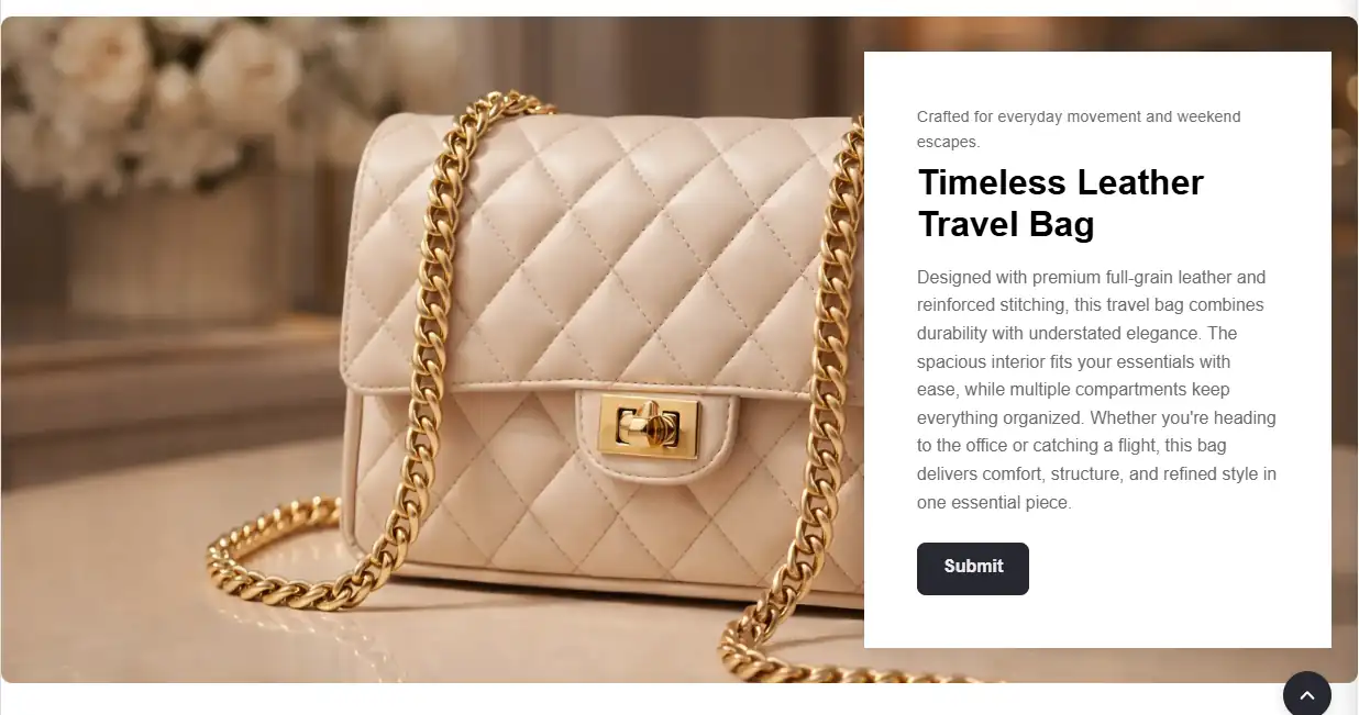
Large Image With Text Box
Multipurpose Fashion Theme
Theme: Multipurpose Fashion Theme
Help Center > Sections & Blocks > Hero & Banner Sections > Large Image with Text Box
Overview
The Large image with text box section displays one large background image with a text box overlay. The text box includes a subheading, heading, body text, and an optional button. Use it for a single, focused hero or feature: one message, one image. It supports left or right layout, optional parallax, and responsive heights. There are no blocks. All content is configured in section settings.
Where to Add This Section
- Go to Online Store > Themes > Customize.
- Select Homepage or the desired template.
- Click Add section.
- Choose Large image with text box.
- Save.
Quick Setup (3 Steps)
- Upload image - Add your background image in section settings.
- Add content - Enter subheading, heading, text, and (optionally) a button.
- Set layout - Choose left or right, then adjust height and alignment for the text box.
Recommended image sizes
- Desktop: 1600 to 2400px wide (JPG or WEBP recommended).
- Mobile: 1000 to 1600px wide, with the subject centered.
- Safe area: Keep important subject matter away from the left or right side where the text box sits.
- File size: Aim for under 500KB to 800KB per image for faster loading.
Section Settings
| Setting | Description | Default |
|---|---|---|
| Full page width | When enabled, the section stretches edge-to-edge across the viewport. When disabled, it follows the theme content width. | Off |
| Subheading | Small text above the heading. | - |
| Heading | Main headline (rich text). | - |
| Heading size | Small, Medium, Large, Extra large. | Large |
| Text | Body text shown inside the text box. | - |
| Button label | CTA button text. Use short, action-oriented text (example: Shop now). | Shop now |
| Button link | CTA button destination URL. If empty, the button should not be shown. | - |
| Button border radius | Button corner radius (0 to 50px). | 8 |
| Button background color | Button fill color (uses theme default when empty). | - |
| Button text color | Button label color (uses theme default when empty). Ensure sufficient contrast. | - |
| Enable button full width on mobile | When enabled, the button stretches to full width on small screens for easier tapping. | Off |
| Image | Background image shown behind the text box. | - |
| Layout | Sets which side the text box appears on: Text left or Text right. | Text left |
| Section height | Desktop height in pixels (450 to 750px). | 550 |
| Mobile height | Mobile height in pixels. If set to 0, the theme uses 400px. | 0 (400px) |
| Enable parallax | Adds a scroll-based motion effect to the background image. | Off |
| Parallax direction | Vertical or Horizontal. | Vertical |
| Horizontal alignment | Fine-tunes the text box horizontal position (Left, Center, Right). | Left |
| Vertical alignment | Fine-tunes the text box vertical position (Top, Center, Bottom). | Center |
| Card max width | Maximum width of the text box in pixels. | 500 |
| Card border radius | Text box corner radius in pixels. | 20 |
| Text alignment | Align text inside the text box (Left, Center, Right). | Left |
Layout vs alignment
- Layout chooses the side (left or right) where the text box is placed.
- Horizontal alignment and Vertical alignment adjust the exact position within the image area.
Button and heading customization
The section includes customizable button and heading options under Button style in the theme editor:
- Heading size - Choose Small, Medium, Large, or Extra large. Heading scales responsively on mobile.
- Button border radius - Control corner roundness (0 to 50px). Default 8px.
- Button background color - Set a custom fill color. Leave empty to use the theme default.
- Button text color - Set a custom label color. Leave empty to use the theme default.
- Enable button full width on mobile - Improves tap targets on small screens.
Step-by-Step Setup
Step 1: Add the section
Add Large image with text box to your template.
Step 2: Add image and content
- Upload an Image (1600px wide or higher for a sharp desktop display).
- Enter Heading and Text.
- Set Heading size (Small, Medium, Large, or Extra large).
- Add a Subheading if desired.
- To show a CTA, set both Button label and Button link.
- Optionally customize Button border radius, Button background color, and Button text color.
- Enable Enable button full width on mobile if you want a full-width CTA on small screens.
Step 3: Configure layout
- Set Layout - Text left or Text right.
- Adjust Section height (typical: 550px, range: 450 to 750px).
- Set Mobile height. If you set it to 0, the theme uses 400px.
- Adjust Horizontal alignment and Vertical alignment to position the text box.
- Set Card max width if the text box feels too wide or narrow.
- Set Text alignment inside the text box (Left, Center, Right).
Step 4: Optional parallax
- Enable Enable parallax to add a scroll effect.
- Choose Parallax direction (Vertical or Horizontal).
- Recommendation: If the effect feels jittery on mobile devices, disable parallax or reduce the section height.
- Save.
Use cases
- Single hero - One strong image with one clear message
- Campaign banner - Focused promotion without slideshow complexity
- Product feature - Product shot with supporting copy
- Brand moment - Statement image with minimal text
Best practices for merchants
- Use a single strong image and one clear message.
- Keep headings short. Keep body text to 1 to 2 sentences.
- Use Heading size to match the page hierarchy.
- Ensure the text box remains readable against the image. If your theme supports overlays, increase overlay strength when needed.
- Use button colors that match your brand and keep contrast high for accessibility.
- Enable Button full width on mobile for easier tapping.
- If parallax impacts performance, disable it, especially on mobile.
Accessibility notes
- Ensure text contrast meets accessibility expectations. Avoid light text on light imagery.
- Use meaningful CTA labels (example: Shop new arrivals, Explore collection) instead of generic text.
- Keyboard users should be able to tab to the button and see a visible focus state (handled by theme styles).
- Background images are typically decorative and should not require alt text. Important information should be in text, not embedded in the image.
- If parallax is enabled, the theme should respect reduced-motion preferences where implemented.
Common mistakes
| Mistake | Fix |
|---|---|
| No image | Upload an Image in section settings. |
| Text is hard to read | Reposition the text box, adjust overlay settings (if available), shorten text, or use a darker image. |
| Section looks too tall on mobile | Set a specific Mobile height (or use 0 to default to 400px) and keep copy shorter. |
| Parallax feels jittery | Disable parallax on mobile, reduce the section height, or use a lighter image file. |
| Button not linking | Add a valid Button link. If the link is empty, remove the button label to hide the button. |
Large Image with Text Box – FAQs
What is the Large Image with Text Box section?
This section displays a large background image with a text content box layered on top. It is ideal for highlighting promotions, brand stories, product launches, or important announcements.
Where should I use this section?
It works well on the homepage, collection pages, or landing pages where you want strong visual impact combined with a clear call-to-action.
Can I control the image position?
Yes. You can place the text box on the left or right side of the image using the layout setting.
Can I adjust the height of the section?
Yes. You can set a custom height for desktop. You can also define a separate height for mobile, or leave it at 0 to automatically adjust based on content.
What is the Parallax option?
Parallax creates a scrolling effect where the background image moves slightly slower than the content. This adds a modern, dynamic feel to your store.
Can I customize the text box appearance?
Yes. You can control:
- Card maximum width
- Card border radius
- Text alignment
- Vertical positioning
Can I customize the button style?
Yes. You can adjust:
- Button border radius
- Button background color
- Button text color
- Full-width button option for mobile
If colors are left empty, the theme default styles will apply.
Is this section mobile responsive?
Yes. The layout automatically adjusts for mobile devices, including optional full-width buttons and optimized image loading.
Does this section affect performance?
No. Images are responsive and lazy-loaded (except when used as the first section for faster loading). This ensures optimal performance.
How can this section increase conversions?
A large visual with clear messaging and a strong call-to-action helps guide customers toward key products or promotions, increasing engagement and sales.