Multipurpose theme documentation
Multipurpose Fashion Theme
Footer Promotion
Multipurpose Fashion Theme
Theme: Multipurpose Fashion Theme
Help Center > Footer > Footer Promotion
Overview
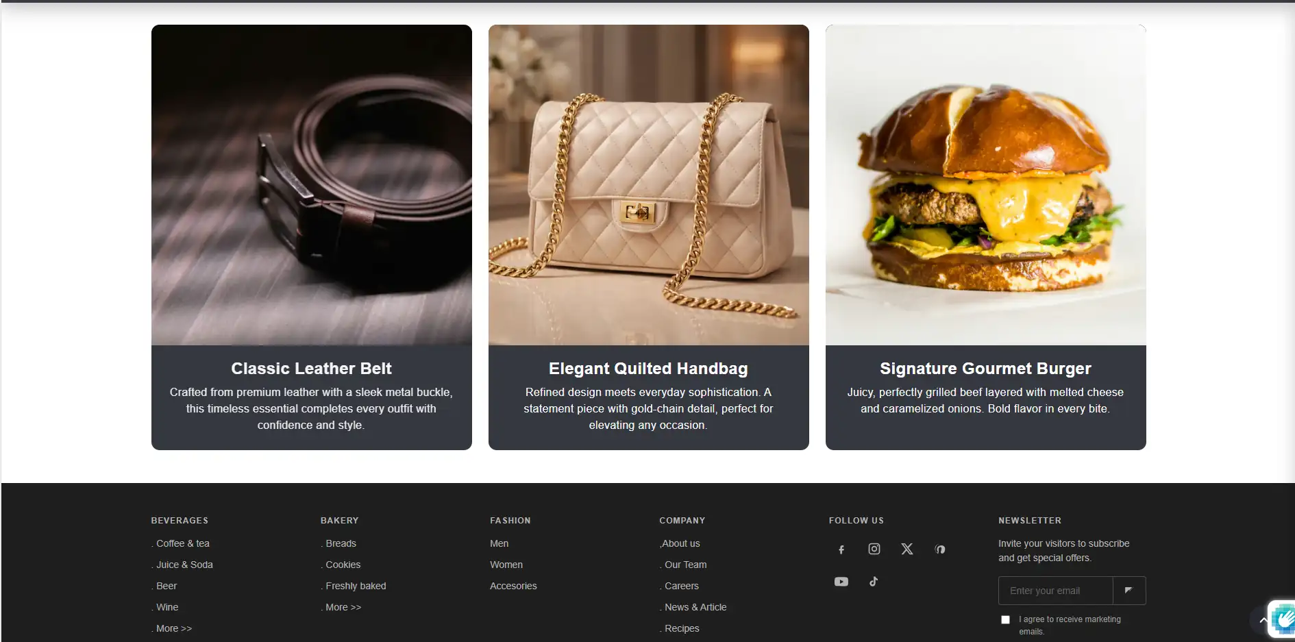
Footer promotion is a section that displays promotional cards above the main footer. Each card can include an image, heading, text, and optional link. Use it to highlight featured products, collections, campaigns, or brand stories. This guide covers how to add, configure, and style the Footer promotion section for merchants, prospective merchants, and theme reviewers.
Where Footer Promotion Appears
The Footer promotion section sits above the main Footer in the theme layout. It appears on all pages that use the default theme template. Typically it shows 1-3 horizontal cards in a responsive grid.
Accessing the Footer Promotion Section
- Go to Online Store > Themes > Customize.
- At the top of the left sidebar, select the theme layout (Default or Theme).
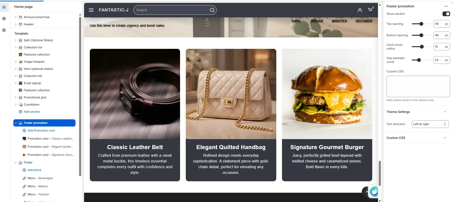
- Scroll to find the Footer promotion section-it's usually directly above the Footer section.
- Click it to view section settings and promotion blocks.
Section Settings
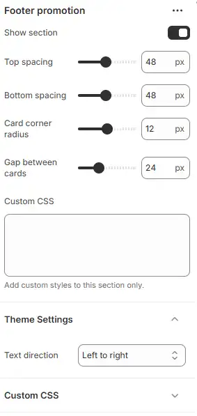
Show section
| Setting | Description | Default |
|---|---|---|
| Show section | Enable or hide the entire section | On |
Turn this off to hide the Footer promotion without deleting blocks. Useful for A/B testing or seasonal campaigns.
Spacing
| Setting | Description | Range | Default |
|---|---|---|---|
| Top spacing | Space above the section (px) | 0-100 | 48 |
| Bottom spacing | Space below the section (px) | 0-100 | 48 |
Adjust spacing to align with the content above and the footer below.
Card styling
| Setting | Description | Range | Default |
|---|---|---|---|
| Card corner radius | Rounded corners on cards (px) | 0-24 | 12 |
| Gap between cards | Space between cards (px) | 12-48 | 24 |
These affect all promotion cards in the section.
Custom CSS
| Setting | Description |
|---|---|
| Custom CSS | Optional CSS scoped to this section |
Use for advanced styling (e.g. custom borders, shadows, typography). CSS applies only to this section.
Promotion Card Blocks
Each promotion is a Promotion card block. Add multiple blocks to create 1-3 (or more) cards.
Adding promotion cards
- In the Footer promotion section, click Add block.
- Choose Promotion card.
- Configure the block settings (see below).
- Add more blocks as needed.
- Reorder blocks by dragging.
- Save.
Promotion Card Block Settings
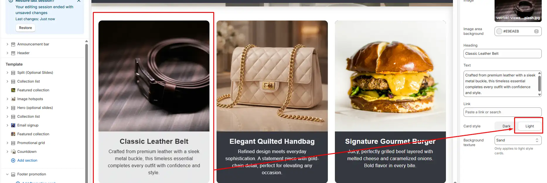
Image and background
| Setting | Description |
|---|---|
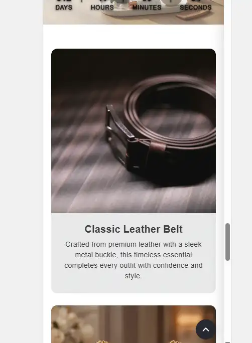
| Image | Promotional image (product, collection, campaign) |
| Image area background | Background color when no image or behind image (#hex) |
- Image: Use a high-quality image (e.g. 600-800px wide). The theme uses responsive srcset for performance.
-
Image area background: Default
#E9EAEB(light grey). Use a color that fits your brand or matches the image. - If no image is set, a placeholder SVG appears.
Content
| Setting | Description |
|---|---|
| Heading | Card title (e.g. "New Arrivals") |
| Text | Body text (supports line breaks) |
| Link | Optional URL-makes the card clickable |
- Heading: Short and impactful.
- Text: Brief description; 1-2 sentences work well.
- Link: Collection, product, or custom URL. Leave blank for a non-clickable card.
Card style
| Setting | Options | Description |
|---|---|---|
| Card style | Dark, Light | Overall card background and text contrast |
- Dark: Dark background (e.g. charcoal #363840) with light text. Suits bold, high-contrast designs.
- Light: Light background with dark text. Softer look; texture options apply.
Background texture (Light style only)
| Setting | Options | Description |
|---|---|---|
| Background texture | None, Linen, Paper, Sand, Space, Dots, Stone | Subtle pattern overlay |
Texture adds depth on Light-style cards. Choose based on your brand aesthetic.
| Texture | Best for |
|---|---|
| None | Clean, minimal |
| Linen | Natural, organic |
| Paper | Craft, stationery |
| Sand | Warm, earthy |
| Space | Modern, tech |
| Dots | Playful, graphic |
| Stone | Industrial, rugged |
Use Cases for Footer Promotion
| Use case | Example setup |
|---|---|
| Featured collections | Image + "Shop Summer Collection" + link to collection |
| Product highlights | Product image + "Best Seller" + link to product |
| Brand story | Brand image + "Our story" + link to About page |
| Campaign or sale | Campaign image + "Winter Sale - 30% off" + link to sale collection |
| Newsletter or signup | Illustration + "Join our list" + link to newsletter form |
| Trust/values | Icon or image + "Sustainable shipping" + optional link |
Layout and Responsiveness
- Desktop: Cards display in a row (1-3 columns depending on block count).
- Tablet: May show 2 columns or stack.
- Mobile: Cards typically stack vertically for easier scrolling and touch targets.
-
RTL: The section respects
dir="rtl"for right-to-left languages.
Best Practices
Content
- Use clear, benefit-focused headings.
- Keep text short (1-3 sentences).
- Add a link when you want the card to drive traffic.
- Use high-quality, on-brand images.
Design
- Prefer consistent card styles (all Dark or all Light) unless you intentionally mix.
- Match image background color to your theme for a cohesive look.
- Test textures on Light cards-some work better with certain images.
Performance
- Optimize images (JPEG/WebP, reasonable dimensions) before upload.
-
The theme uses
loading="lazy"and responsive srcset for good performance.
For merchants
- Start with 2-3 promotion cards for key collections or campaigns.
- Update images and copy seasonally or for promotions.
- Use links to drive traffic to high-value pages.
- Test both Dark and Light styles to see what fits your brand.
Common mistakes
| Mistake | Fix |
|---|---|
| Section not visible | Ensure Show section is On and at least one promotion block exists |
| Cards look empty | Add heading, text, and/or image to each block |
| Image too large/slow | Use images 600-800px wide; optimize before upload |
| Link not working | Use a valid URL (collection, product, or page) |
| Texture not visible | Texture applies only to Light card style |
| Cards cramped | Increase Gap between cards in section settings |