Multipurpose theme documentation
Multipurpose Fashion Theme
Header General
Multipurpose Fashion Theme
Theme: Multipurpose Fashion Theme
Help Center > Header > Header - General
Overview
The general header is the primary navigation area at the top of your store. It creates the first impression for visitors and houses your logo, tagline, navigation links, and key actions. This guide covers how to customize logo, tagline, navigation, layout options, and the sticky header behavior. It is written for merchants, prospective merchants, and theme reviewers.
Accessing the Header Section
Customizing the Logo
The logo is the centerpiece of your header and reinforces your brand identity.
Adding or changing the logo
- In the Header section, locate the Logo block.
- Use the Image picker to upload or select your logo.
- Recommended formats: PNG or SVG for transparency; recommended width: 200-400px for desktop.
Logo sizing
| Setting | Description | Typical range |
|---|---|---|
| Desktop width | Logo width on desktop (px) | 100-300px |
| Mobile width | Logo width on mobile (px) | 80-180px |
Adjust these values to balance brand visibility with space for navigation and other header elements.
White logo for overlay header
When using an overlay (transparent) header on homepage or
collection pages,
use a light-colored logo for contrast against hero images. The Logo block
includes a White logo (or Light logo)
option for overlay pages.
Navigation Links
Navigation links are driven by Shopify's Navigation menus, not the theme alone.
Assigning the main menu
- Go to Shopify Admin > Online Store > Navigation.
- Create or edit your main menu (e.g. Main menu).
- Add menu items with links to collections, pages, or custom URLs.
- In the Theme Customizer > Header section, ensure Main menu is set to this navigation menu.
- Save.
Header layout options
The theme offers multiple header layouts. Common options include:
| Layout | Description | Best for |
|---|---|---|
| Logo left, menu left | Logo and menu on same row, aligned left | Wide headers, many menu items |
| Logo left, menu below | Logo on top; menu on second row | Large logos, few menu items |
| Logo center, menu below | Centered logo; menu beneath | Strong brand focus, simple nav |
Choose a layout that fits your logo size and number of menu items.
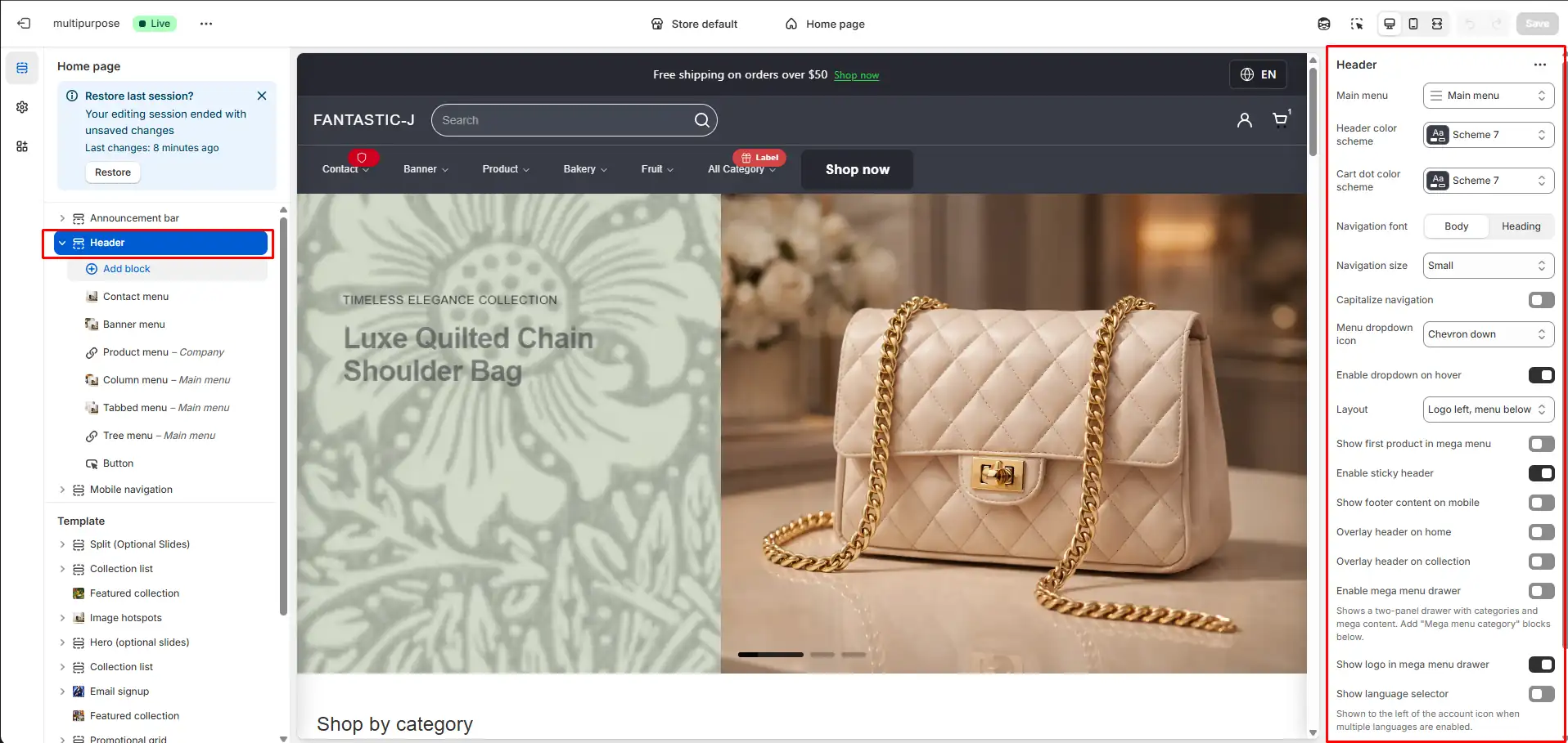
Section settings affecting navigation
| Setting | Description |
|---|---|
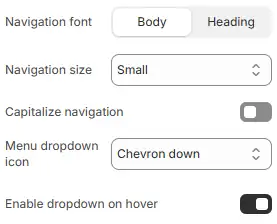
| Navigation font | Body or heading font for menu items |
| Navigation size | Small or medium |
| Capitalize navigation | Display menu labels in all caps |
| Menu dropdown icon | Chevron down or none |
| Enable hover dropdown | Open dropdowns on hover (desktop) |
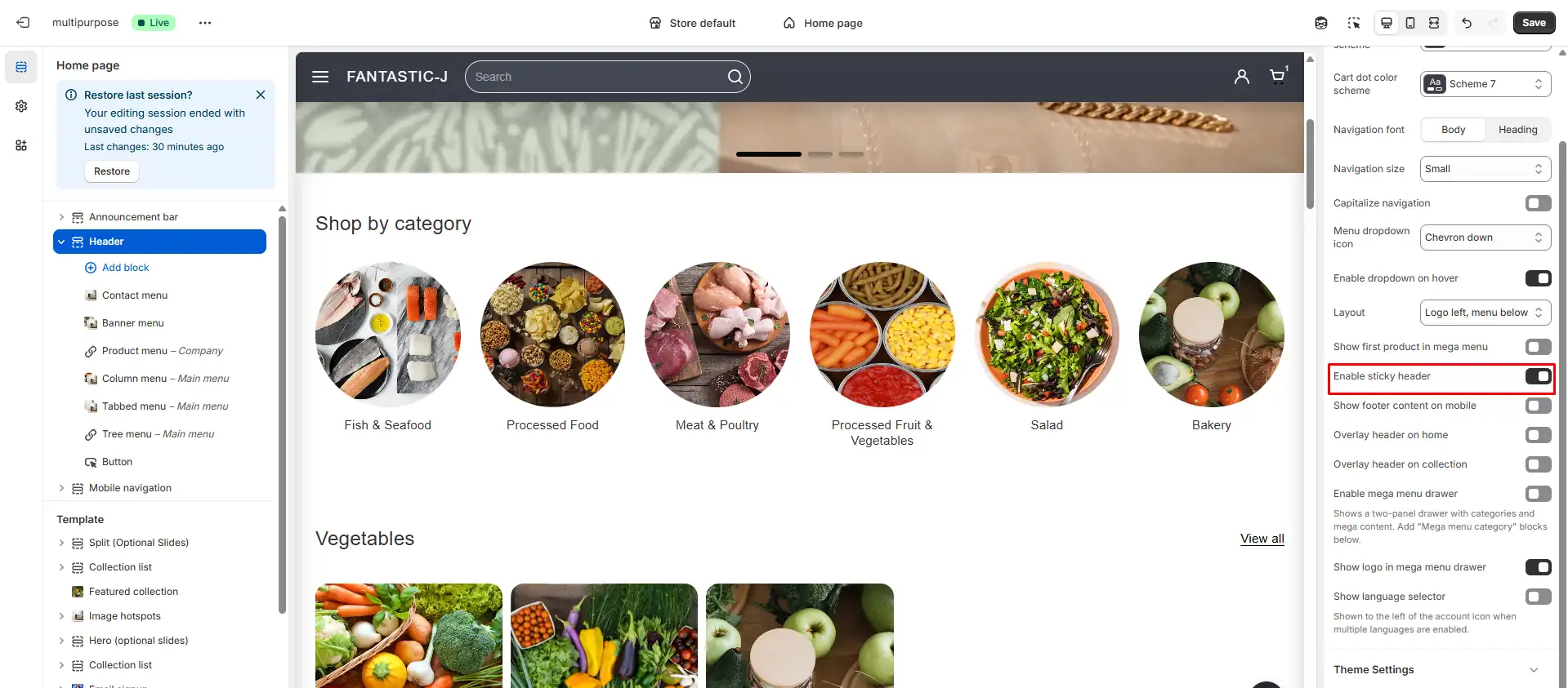
Sticky Header
A sticky header remains fixed at the top of the viewport when users scroll, keeping navigation, cart, and search always accessible.
How to enable
- Open the Header section in the Theme Customizer.
- Find Enable sticky header in the section settings.
- Turn the toggle On.
- Save.
The header will stay visible as visitors scroll down the page.
When to use a sticky header
- Use it when: You want quick access to cart and menu on long product or collection pages.
- Consider disabling when: You need more vertical space for content or a minimalist layout.
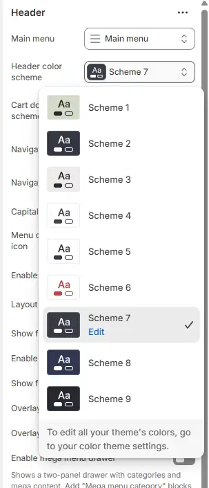
Header Color Scheme
Header colors are often controlled by a Header color scheme or Color scheme setting.
- Background: Solid color or transparent (for overlay).
- Text/Links: Choose colors that meet contrast requirements (WCAG).
- Hover states: Links and buttons typically have hover styles defined in the theme.
Configure in Header section settings or Theme settings > Colors if the header uses a global scheme.
For merchants
- Start with a clear logo and simple navigation; add complexity (mega menus, tagline) as needed.
- Test the header on mobile and tablet to ensure it's readable and usable.
- Use a sticky header for long pages, but verify it doesn't cover important content.
Common mistakes
| Mistake | Fix |
|---|---|
| No white logo with overlay header | Add a light logo in the Logo block for overlay pages |
| Logo too large on mobile | Reduce mobile width in Logo block settings |
| Menu not showing | Assign the correct navigation menu in Header section |
| Sticky header covering content | Ensure adequate top padding on page content |
FAQs
The Header is a global section that appears at the top of every page. It typically includes:
- Logo
- Main navigation
- Search
- Account access
- Cart access
- Optional language selector
Because it appears on all pages, it plays a major role in usability, branding, and conversion.
- Navigation: Helps customers find products quickly.
- Brand recognition: Displays your logo consistently.
- Conversion support: Provides fast access to cart and checkout.
- Trust: Clean structure increases user confidence.
A poorly structured header can increase bounce rate and reduce product discovery.
Your header supports multiple layout strategies:
- Logo left, menu below
- Logo left, menu left
- Logo center, menu below
Layout choice affects visual hierarchy and brand positioning:
- Left-aligned logo: Common in ecommerce and improves usability.
- Centered logo: Often used in fashion or luxury branding.
- Menu below: Better for large catalogs.
A sticky header remains visible while users scroll.
Benefits:
- Constant access to navigation
- Improved conversion rate
- Faster cart access
Best practice: Use sticky headers on stores with long content pages.
Overlay headers appear transparent on hero sections and banners.
Used when:
- Homepage has a large image banner
- You want a modern aesthetic
Important: Ensure sufficient contrast between text and background.
Navigation can open:
- On hover (desktop)
- On click (desktop & mobile)
Hover menus provide faster access but require careful accessibility handling. Click-based menus are more mobile-friendly.
Mega menus are used for stores with large product catalogs.
Advantages:
- Multi-column organization
- Product highlights
- Promotional banners
Use mega menus when your catalog has multiple collections and subcategories.
Navigation typography affects perceived brand tone:
- Body font: Neutral, minimal, modern.
- Heading font: Bold, branded, expressive.
Larger navigation sizes improve readability but may reduce space efficiency.
The header integrates:
- Account access (login / register)
- Cart page or cart drawer
Cart drawers improve UX by avoiding page reload. Cart pages are simpler and require less scripting.
The header search supports:
- Standard search submission
- Predictive search (if enabled globally)
Predictive search improves product discovery and reduces friction.
The header can display:
- Language selector
This is especially important for international stores.
A properly structured header should:
- Include ARIA labels
- Support keyboard navigation
- Provide skip-to-content links
- Use semantic HTML structure
Accessibility improves compliance and user inclusivity.
Because the header loads on every page, it should:
- Minimize heavy scripts
- Load assets conditionally
- Optimize images (logo sizes)
Header performance directly impacts overall site performance.
- Keep navigation labels concise
- Avoid too many top-level items
- Maintain strong color contrast
- Use sticky header strategically
- Ensure mobile drawer usability
You may consider customization when:
- Your store grows beyond simple navigation
- You require advanced mega menus
- You need advanced localization
- You want unique branding presentation
However, major structural changes should maintain accessibility and performance standards.