Multipurpose theme documentation
Multipurpose Fashion Theme
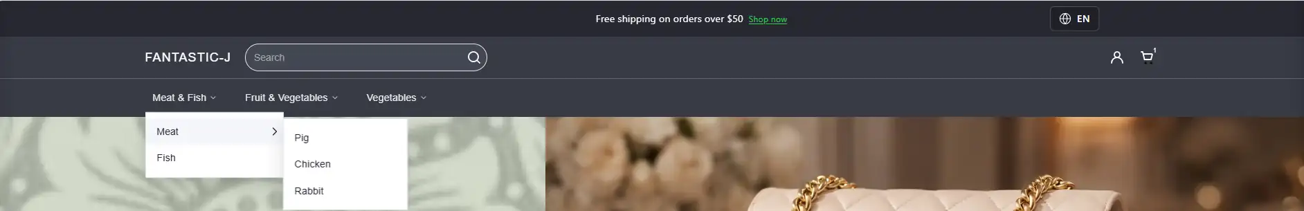
Header Drop Down Menu
Multipurpose Fashion Theme
Theme: Multipurpose Fashion Theme
Help Center > Header > Drop-Down Menu
Overview
Drop-down menus organize your navigation into hierarchical sub-menus. Shoppers can access sub-pages, collections, or custom links directly from the main navigation without leaving the header. This guide explains how to create, structure, and customize drop-down menus in Shopify Navigation and in the theme. It is written for merchants, prospective merchants, and theme reviewers.
How Drop-Down Menus Work
Drop-down menus are defined in Shopify Admin > Navigation. The theme reads this structure and renders it as expandable menus. You do not need code to create drop-downs-only proper menu structure in Shopify.
| Concept | Description |
|---|---|
| Parent item | Top-level menu item that expands to show children |
| Child item | Sub-menu link nested under a parent |
| Depth | Number of levels (e.g. 2 levels = main → sub) |
Creating a Drop-Down Menu in Shopify
Step 1: Open the Navigation editor
- In Shopify Admin, go to Online Store > Navigation.
- Click the menu you use in the header (e.g. Main menu).
- The menu editor opens with a list of menu items.
Step 2: Add parent items
- Click Add menu item.
- Enter a Name (e.g. "Shop", "Collections", "About").
- Set the Link (collection, page, or custom URL).
- Save. This becomes a top-level (parent) item.
Step 3: Add child items (sub-menu)
- Click Add menu item again.
- Enter the name and link.
- Indent the item: Drag it slightly to the right, or use the handle to nest it under a parent. In Shopify's editor, nested items appear indented under their parent.
- Repeat for additional child items.
- Save the menu.
Step 4: Add a third level (optional)
- Add another menu item and indent it further so it appears under a child item.
- Limit depth to 2-3 levels for usability; deeper nesting can be hard to use, especially on mobile.
📷 Image placeholder: Add a screenshot of the Shopify Navigation editor showing parent items and indented child items.

Assigning the Menu to the Header
- Go to Online Store > Themes > Customize.
- Select the Header section.
- In section settings, find Main menu (or equivalent).
- Choose the navigation menu that contains your drop-down structure.
- Save.
The theme will automatically render your nested structure as drop-downs.
Theme Customization for Drop-Downs
The Header section typically includes options that affect how drop-downs appear and behave.
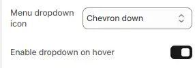
Common settings
| Setting | Description | Values |
|---|---|---|
| Menu dropdown icon | Icon next to items that have children | Chevron down, None |
| Enable hover dropdown | Open dropdown on hover (desktop) | On, Off |
Hover vs. click behavior
- Hover (desktop): Dropdown opens when the cursor hovers over the parent. Useful for fast navigation.
- Click: Dropdown opens on click. Often used on mobile and when hover is disabled for accessibility.
Best Practices for Menu Structure
| Do | Don't |
|---|---|
| Use clear, short labels (1-3 words) | Use long phrases or sentence-like names |
| Limit to 2-3 levels of depth | Create 4+ levels of nesting |
| Group related items under one parent | Add too many top-level parents |
| Link parent to a collection or campaign page | Leave parent with no link if it only has children |
| Test on mobile for touch targets | Assume desktop-only behavior |
Mobile Behavior
On mobile, drop-down menus typically:
- Appear inside a hamburger or slide-out menu
- Expand when the user taps the parent item
- May use accordion-style expand/collapse
Ensure parent items are tappable and children are easy to reach. Theme settings may offer mobile-specific options for menu behavior.
📷 Image placeholder: Add a screenshot of the mobile menu with an expanded drop-down.
For merchants
- Plan your menu structure before building: map collections and pages to parent/child relationships.
- Use consistent naming (e.g. "New Arrivals", "Best Sellers") to help shoppers find categories quickly.
- Test drop-downs on real devices to ensure touch targets and spacing work well.
Common mistakes
| Mistake | Fix |
|---|---|
| Child items at top level | Indent items under the correct parent in Navigation |
| Menu not updating in theme | Ensure the correct menu is assigned in Header section |
| Dropdown not opening | Check hover/click settings; test in another browser |
| Too many items in one dropdown | Split into multiple parents or use a mega menu |
FAQs
A Drop-Down Menu is a hierarchical navigation system that allows merchants to organize links under parent menu items. When customers hover (desktop) or tap (mobile) a parent item, its sub-menu links are displayed.
- Go to Shopify Admin
- Navigate to Content → Menus (or Online Store → Navigation)
- Create or edit a menu
- Drag menu items underneath a parent item to create hierarchy
Nested items automatically become drop-down links in the header.
The theme supports:
- Level 1: Main navigation item
- Level 2: Drop-down items
- Level 3: Nested sub-items (if enabled in theme)
Additional levels beyond three are not recommended for usability.
- Regular drop-down: Vertical list of links under a parent item.
- Mega menu: Multi-column layout with grouped links, images, or promotional content.
Mega menus require theme support and structured menu naming or configuration.
Common reasons include:
- No nested items under the parent link
- Menu not assigned to the header
- Header layout disabled
- Theme caching not refreshed
The drop-down aligns automatically relative to the parent item. Alignment behavior depends on header layout:
- Left-aligned navigation
- Centered navigation
- Right-aligned navigation
Yes:
- Desktop: Opens on hover
- Mobile: Opens on tap
Mobile navigation converts into an expandable accordion structure.
Standard drop-downs support text links only. To include images or banners, you must use a mega menu configuration if supported by the theme.
Reorder items directly in Shopify's menu editor using drag-and-drop. Changes reflect automatically in the header.
Yes. A parent menu item can:
- Link to a page or collection
- Contain nested drop-down items
Clicking the parent link navigates to its URL, while hovering reveals sub-items.
Yes. The navigation includes:
- ARIA roles
- Keyboard navigation support
- Focus states for accessibility compliance
No negative impact. All links are standard anchor links, which are crawlable by search engines. Proper menu structure can improve site architecture and internal linking.
No. Multi-column layouts require mega menu support within the theme's header configuration.
This may occur due to:
- Long menu titles
- Custom CSS overrides
- Viewport width constraints
Ensure navigation labels are concise and avoid excessive nesting.
By default, no. This requires custom CSS or theme modification.
Yes. On smaller screens:
- Navigation converts to a mobile drawer
- Sub-menus expand vertically
- Touch-friendly spacing is applied
Yes. Create collection links in Shopify's menu editor and group them under parent items to form category drop-downs.